
Applications
Website and landing pages
How hey-albert.app is built, how it speaks and what it shows — fourteen sections, landing pages per audience, eleven languages, preview images and the bar for performance and accessibility.
The website does not sell features; it answers mistrust. Anyone who opens it asks three things, in this order: Do I understand what this is in five seconds? Do I believe it helps us? Do I trust these people with my family?
That is exactly how the page is built: clarity → proof → trust → action. Every sentence comes from docs/24-homepage.md; the technology is in docs/23-website.md.
Four rules above everything
- Conventional in structure, distinctive in voice and image. Hero, problem, process, proof, trust, price, questions, call. What looks expected feels trustworthy. Language and drawing may be original, the structure never.
- Show, don’t claim. The real week board with open items convinces more than any claim about overview.
- Trust through limits, not seals. No padlock, no badge. Five promises anyone can check.
- One goal per screen, one verb per button, one field per form. Every extra field costs sign-ups.
The hero
The first screen says what Albert is and shows it. On desktop the text sits left and the image right. On the phone the text sits on top, and the button is visible without scrolling.
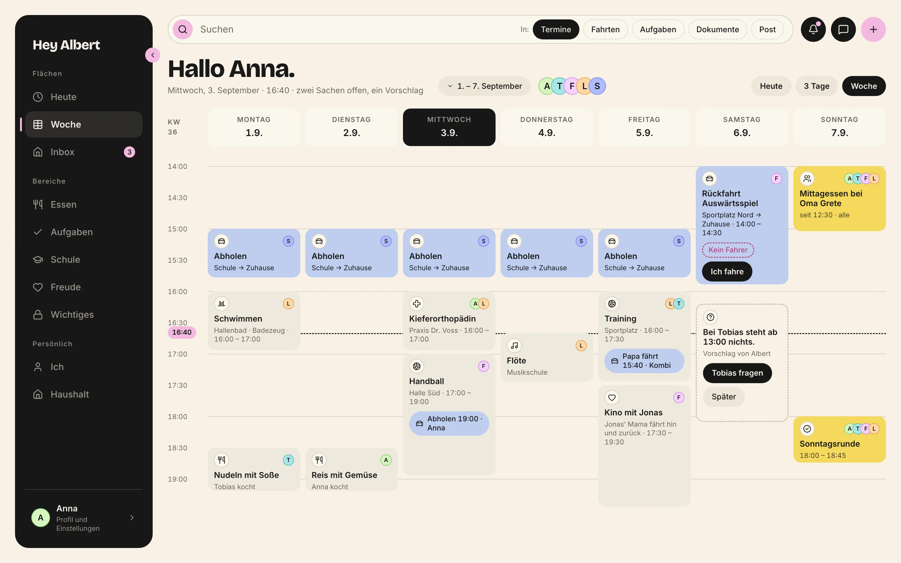
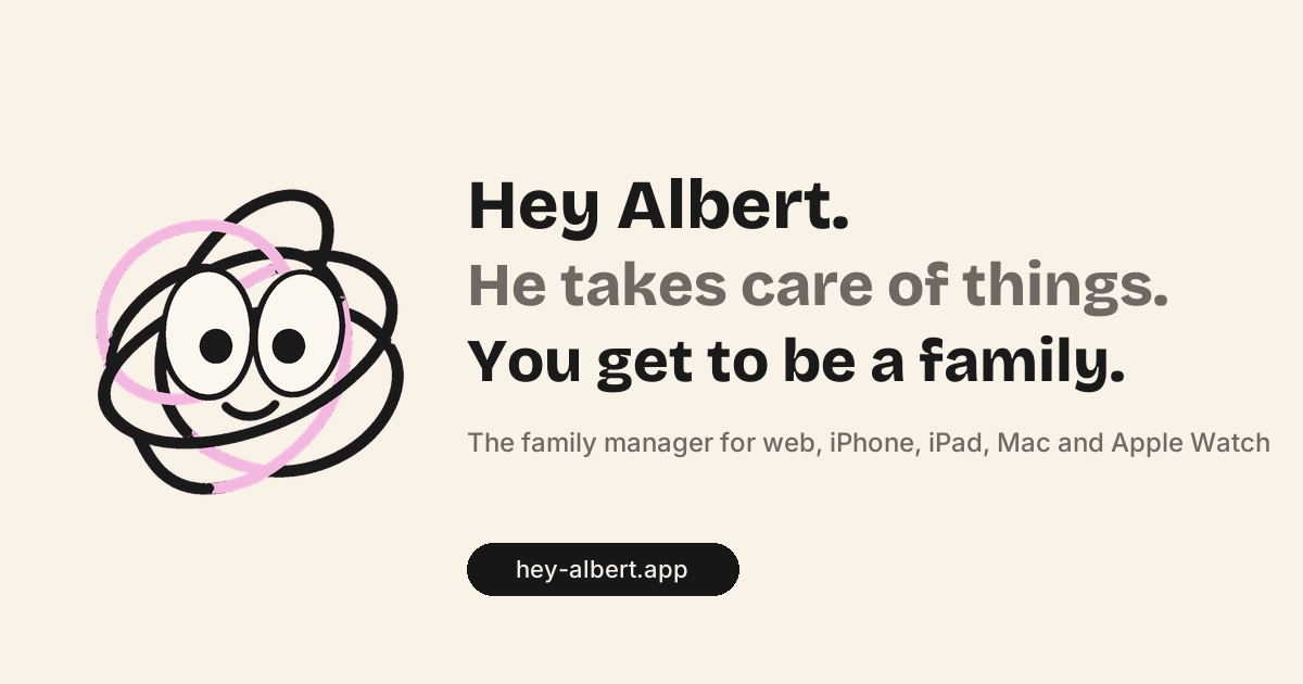
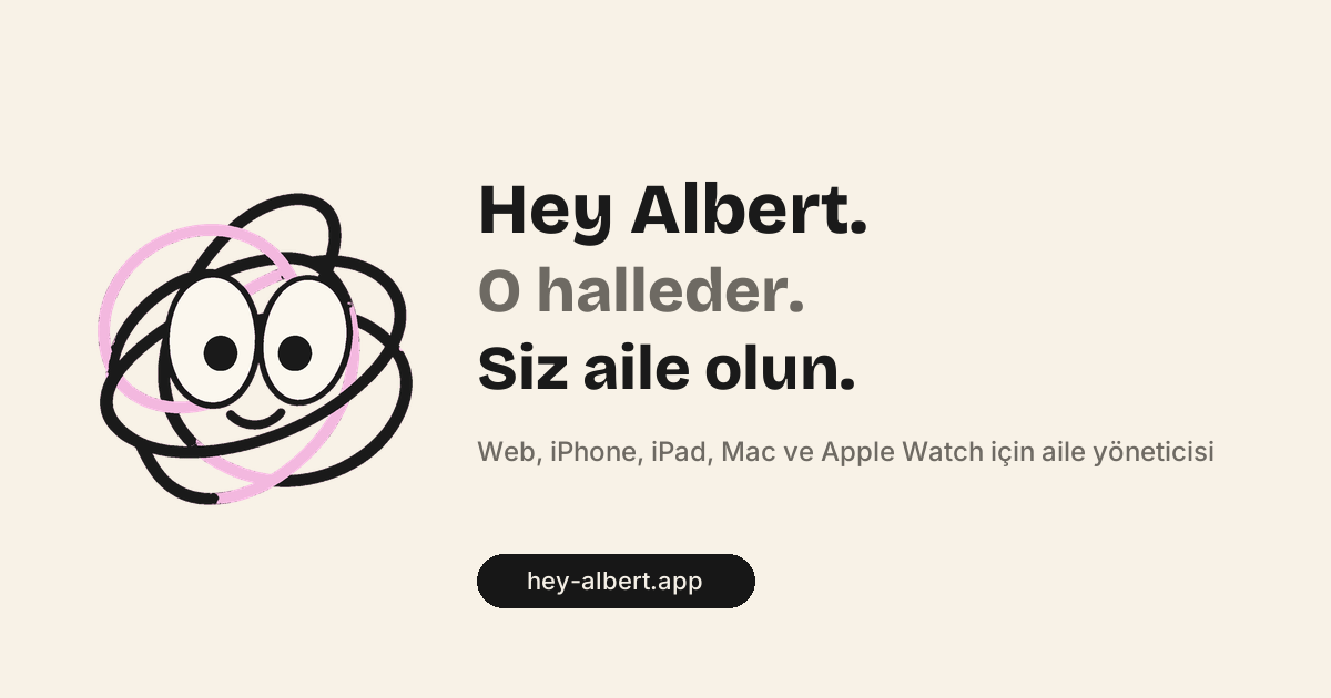
- Headline: „Hey Albert. He takes care of things. You get to be a family.“
- Explainer line: a scene, not a definition. Appointments, drives, meals, homework, contracts, deadlines.
- One field, one button: „Become a test family“. After launch: „Get it on the App Store“.
- Trust line, small: devices · data in Frankfurt · Albert reads only what you give him.
- Caption: the Sonntag family is our example family.
The fourteen sections
The temperature changes on purpose: warm, calm, sober, warm again. The narrator register (Erzähler) for headlines and body copy, the clerk (Sachbearbeiter) for trust, price and questions. Never mix them.
| No. | Section | Job | Register | Image |
|---|---|---|---|---|
| 1 | Hero | understand in five seconds | narrator | week board on the Mac |
| 2 | Three moments | „we know that“ | narrator | three drawings |
| 3 | How it works | say → see → Sunday | narrator | three crops |
| 4 | The hero view | the one image | narrator | week board, large, with margin notes |
| 5 | Five things | scope without overload | narrator | five screens, alternating |
| 6 | Your family, your year | family feed, review, occasion, book | narrator | iPhone, Mac, photo of the book |
| 7 | Everywhere | people, time zones, currencies | narrator | household |
| 8 | What you can hold us to | trust through limits | clerk | hairline icons |
| 9 | Children take part | the warmest section | narrator | Lena’s iPad and iPhone |
| 10 | Who builds Albert | real people | narrator | one real photo |
| 11 | Price | no surprise later | clerk | three cards |
| 12 | Questions | remaining doubts | clerk | accordion |
| 13 | Closing | second call to action | narrator | badge, QR code |
| 14 | Footer | legitimacy, language choice | clerk | — |
Albert as a character appears three times: small in the hero, at the „say it“ step, in the children’s section. Never at price, questions or trust.
{
  "satzlaenge_max": 18,
  "anteil_ueber_15_max": 0.08,
  "silben_je_wort_max": 1.7,
  "wortteil_zeichen_max": 14,
  "wstf4_kinder_max": 5,
  "wstf4_erwachsene_max": 9,
  "homepage": {
    "hero_woerter_max": 40,
    "sektion_woerter_max": 90,
    "seite_woerter": [
      600,
      800
    ]
  }
}
Reading level is grade 5 to 7. People read the page at 22:40 on their phone. Every section contains something concrete: a name, a time, an amount or an object. „Friday, 18:40“ beats „open appointments“.
The budget per section from docs/24 §8: hero under 50 words, every section under 90, sections 5 and 12 under 200.
Buttons name the outcome
A button says what happens next. It fits on one line and has a verb.
Address
The website speaks to at least two adults. So German uses the plural ihr throughout — not the singular du, never the formal Sie. Other languages use the form for the family: you, vosotros, vous, voi, siz.
Images
The product is the subject. Real screens of the Sonntag family on flat device frames, without gloss, without perspective, cropped rather than three-dimensional.
We show
- real screens of the Sonntag family on flat device frames
- flat ink drawings with exactly one yellow accent
- exactly one real photo: the founder
- one physical object: the printed yearbook
We never show
- children’s faces
- stock photos
- AI-generated images
- gloss, perspective, 3D devices
- carousels, autoplay video
- real family data
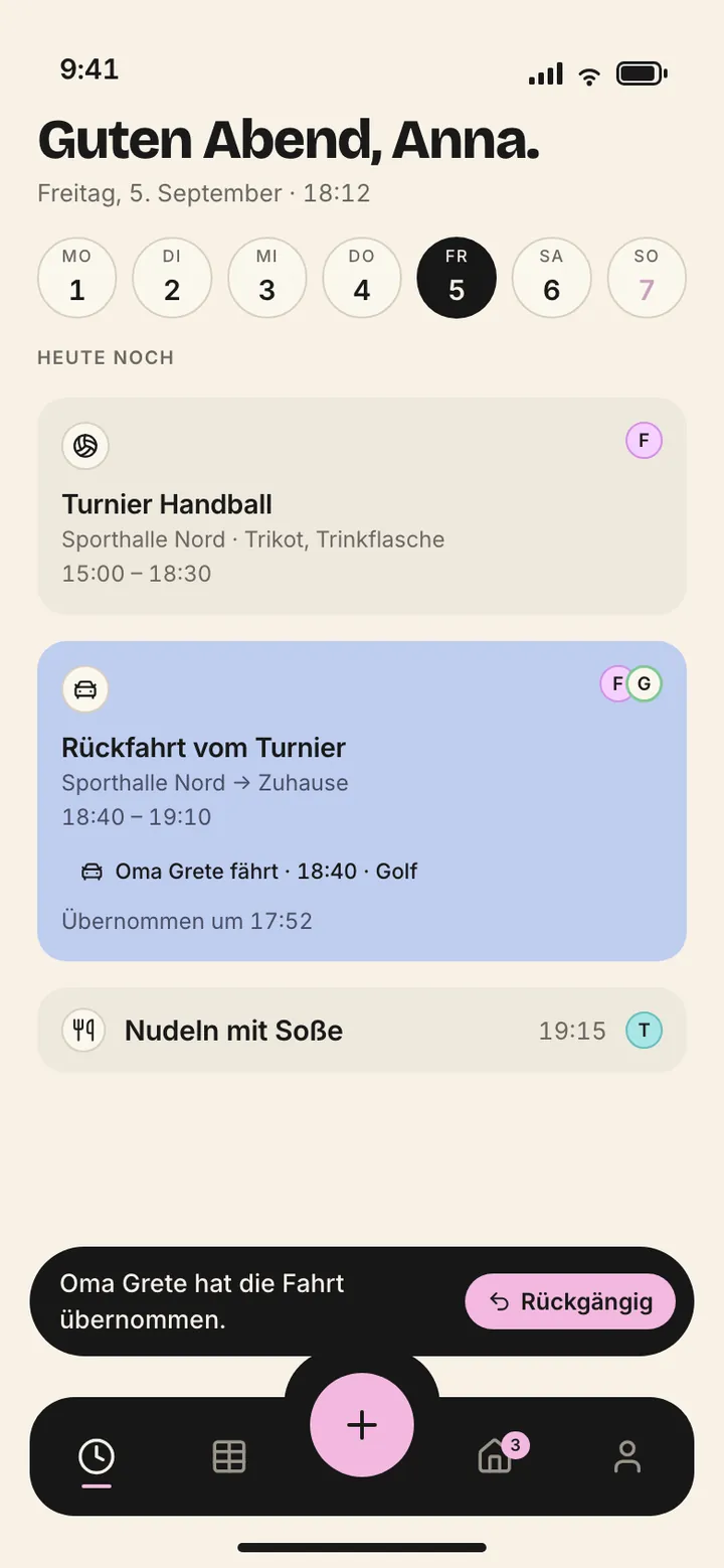
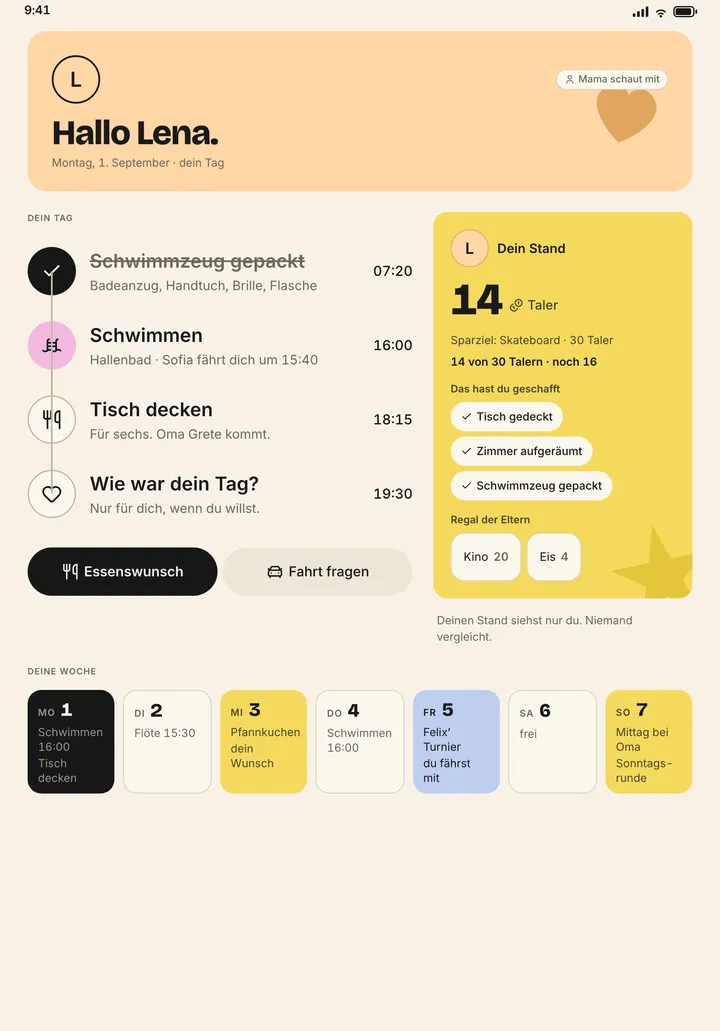
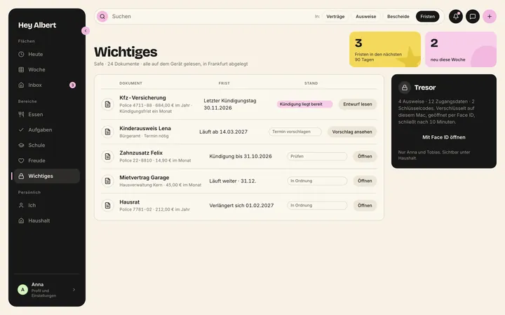
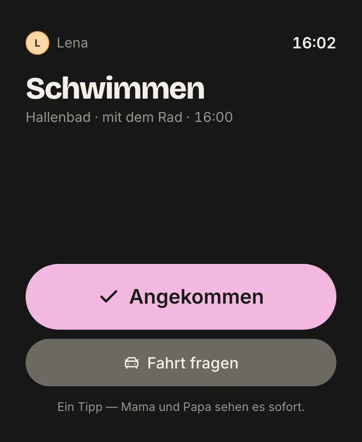
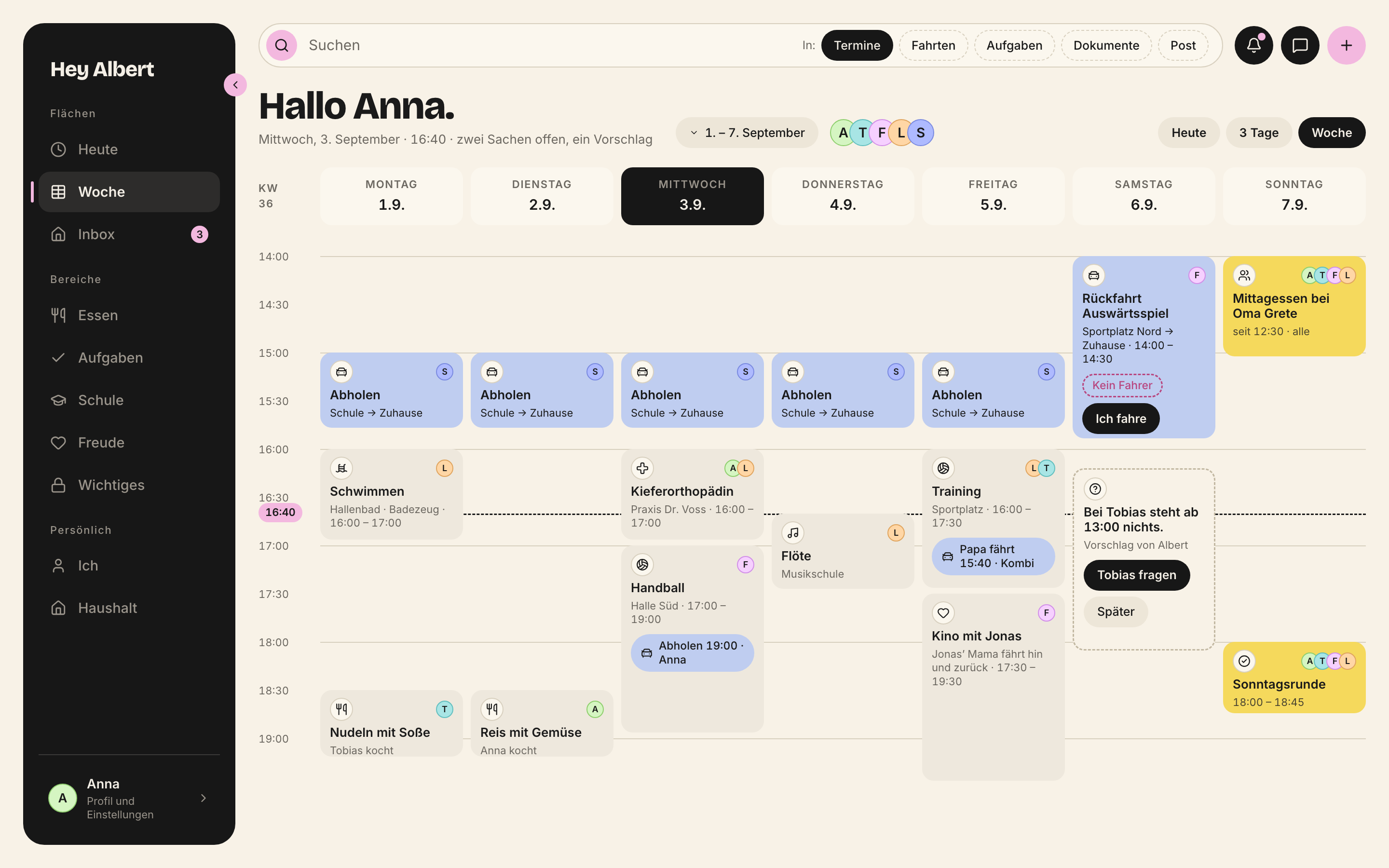
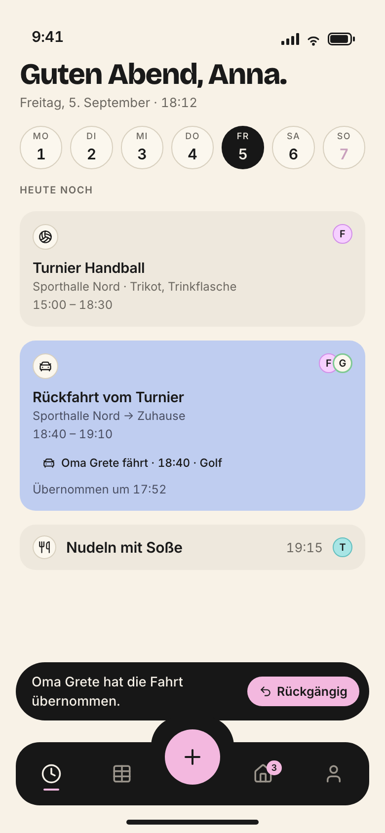
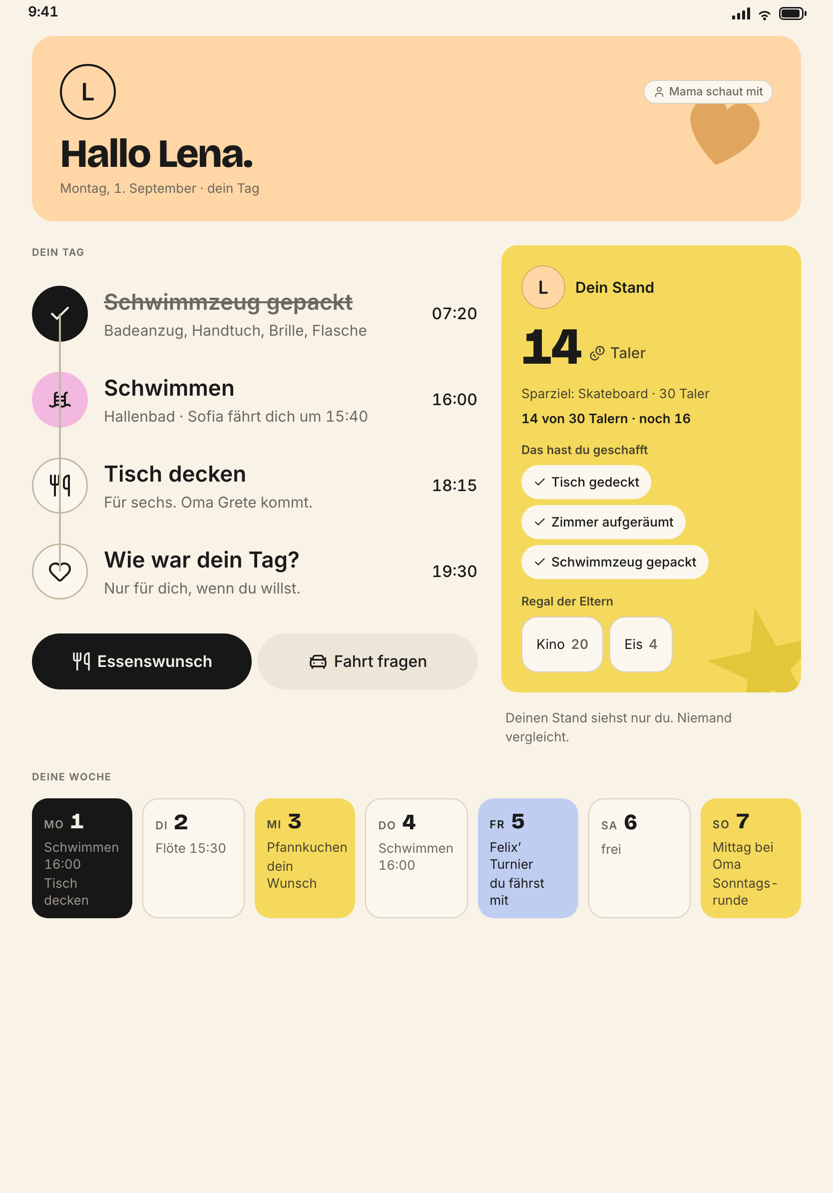
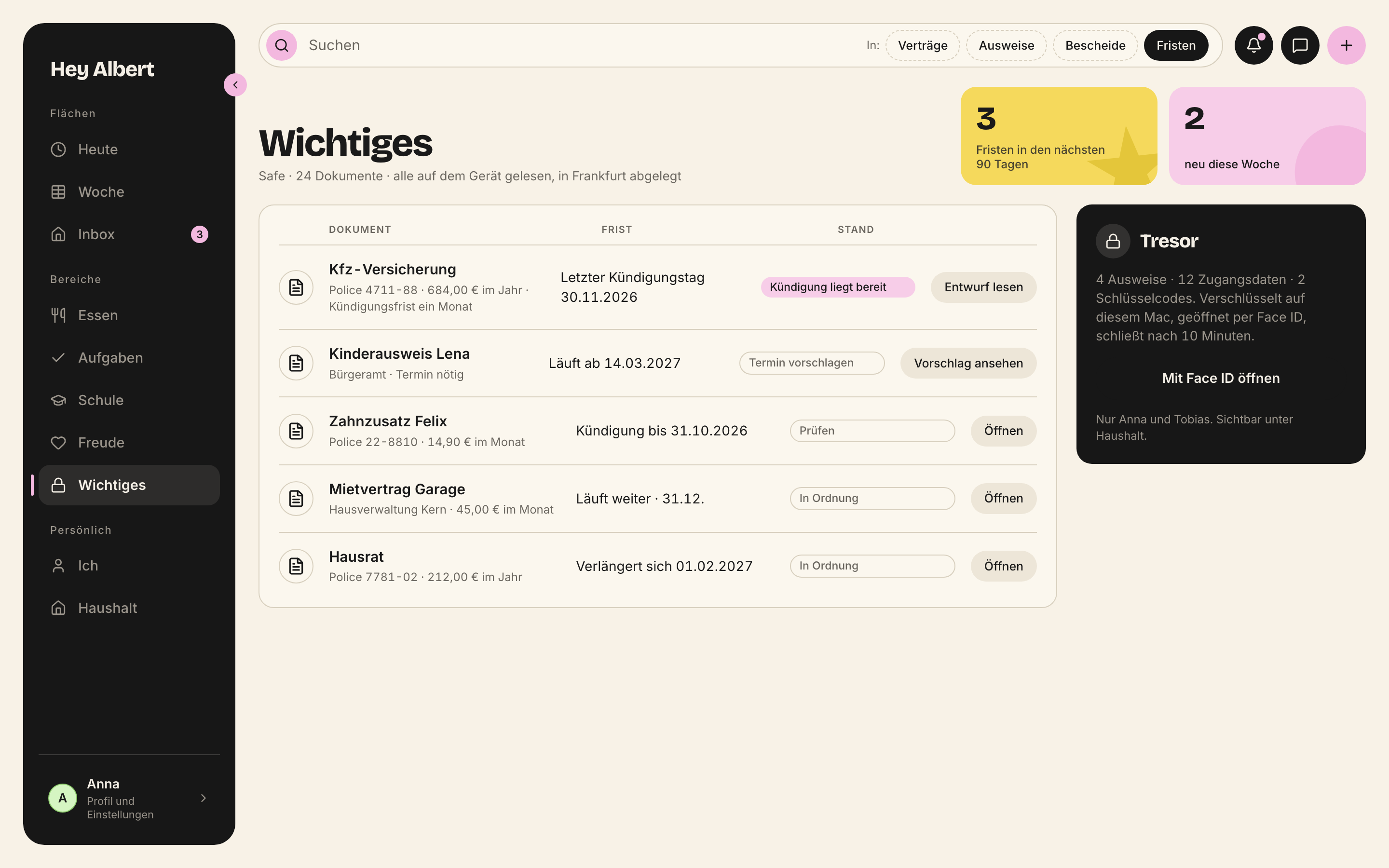
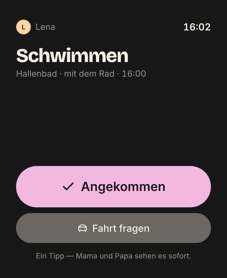
The person colours from the design system are also the campaign colours. Anyone who knows Anna recognises her mint. More in the chapter Imagery.
Phone first
79 % of visits come from a phone. The page is built for the phone first.
- The button is on the first screen, no scrolling needed.
- From section 2 a fixed button sits at the bottom: „Put us on the list“. It disappears as soon as a field is in view.
- Screens sit in iPhone frames. The week board scrolls sideways or becomes a day list.
- On the phone the „Areas“ menu is a list without thumbnails.
Landing pages
Landing pages exist on two axes. Both use the same blocks as the home page.
- Per search term: five pages per language for the core terms calendar, planner, organiser, shared calendar, household planner. Title and H1 carry the term. Below come intro, field, image, three building blocks, questions, second field.
- Per audience: six segments with their own campaign — singles, couples, families with one child, with several children, with grandparents at home, in two households. Each segment has a brief, a landing page in German and English, social drafts and a campaign with UTM.
The door is open: „for families, couples and everyone who runs a household“. The stage stays the family. The household is the unit, not the number of children.
Languages and markets
German is the master. The website appears in eleven languages: German, English, Spanish, French, Italian, Turkish, Polish, Bulgarian, Swedish, Danish, Norwegian. Languages spoken in several countries add country versions: /de-at/, /de-ch/, /en-gb/, /en-ie/, /en-us/.
- One domain, folders per language and country. Country domains redirect with a 301 to the matching folder.
hreflangandcanonicalon every page./en/is the international version.- The source for markets, paths and prices is
packages/markets. - A native speaker reads every version before it goes live.
What stays the same in every language: Hey Albert, Albert, the names of the Sonntag family, Frankfurt, Face ID, App Store, iPhone, iPad, Mac.
Preview images for links
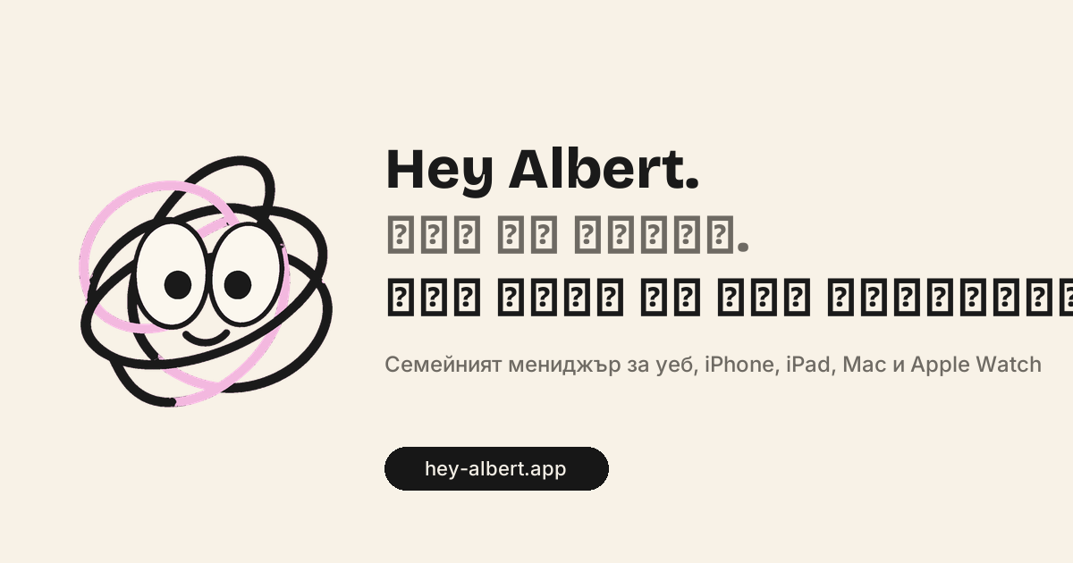
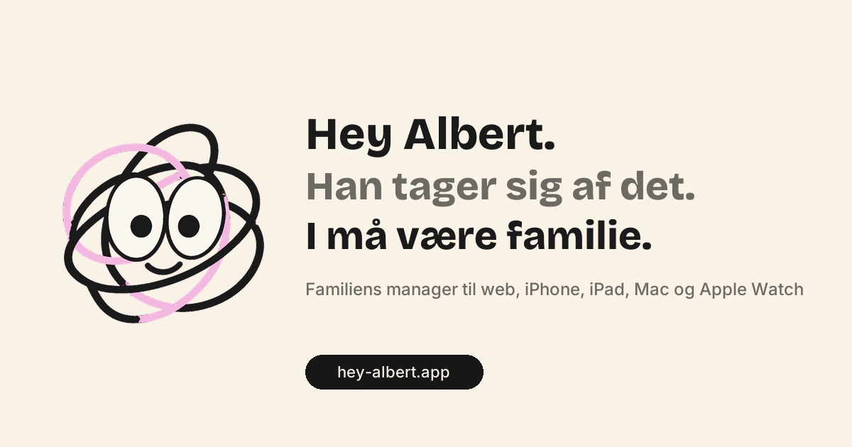
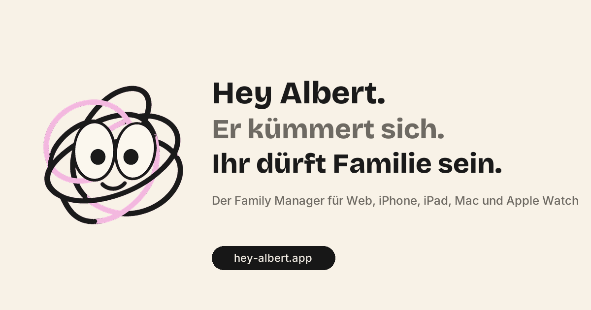
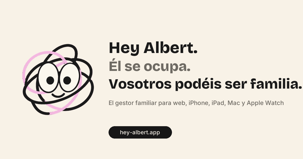
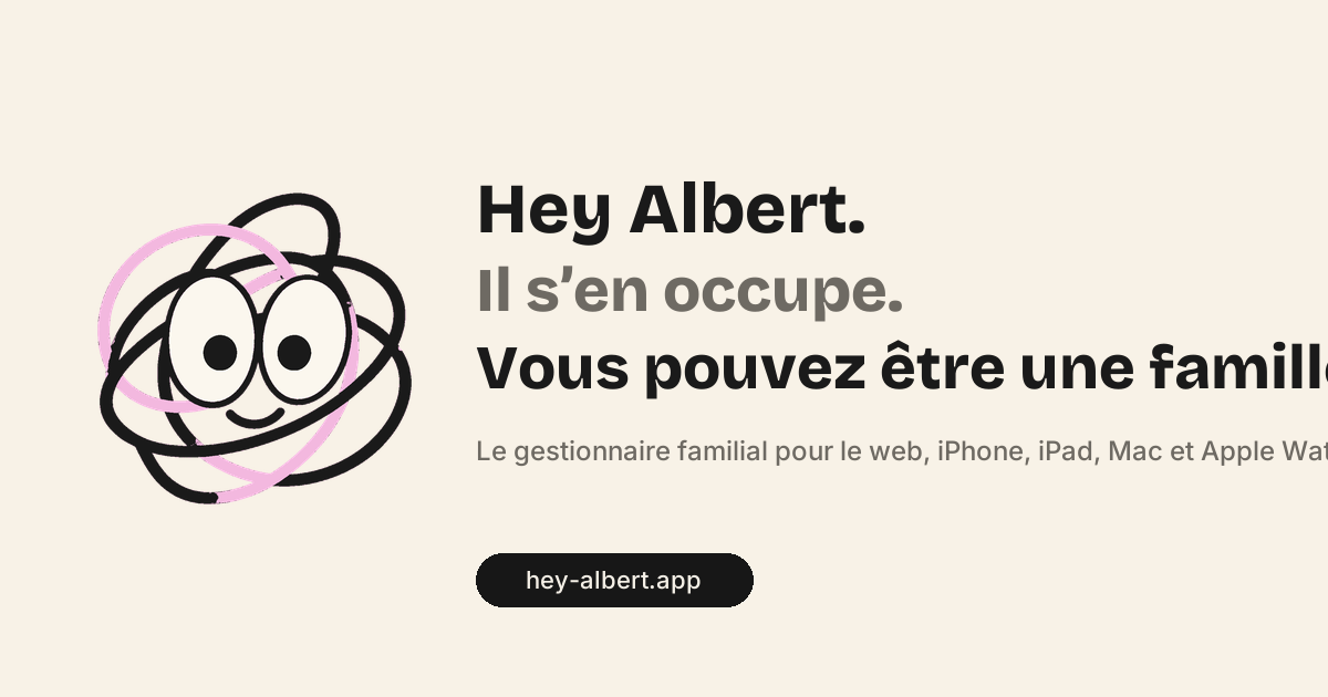
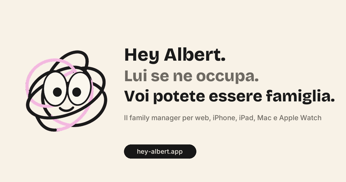
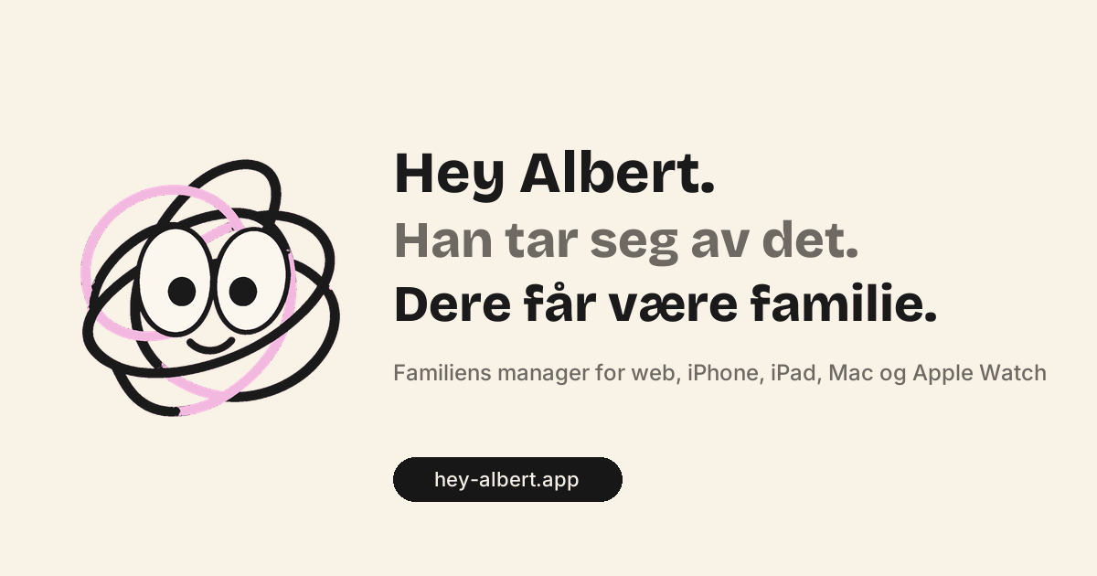
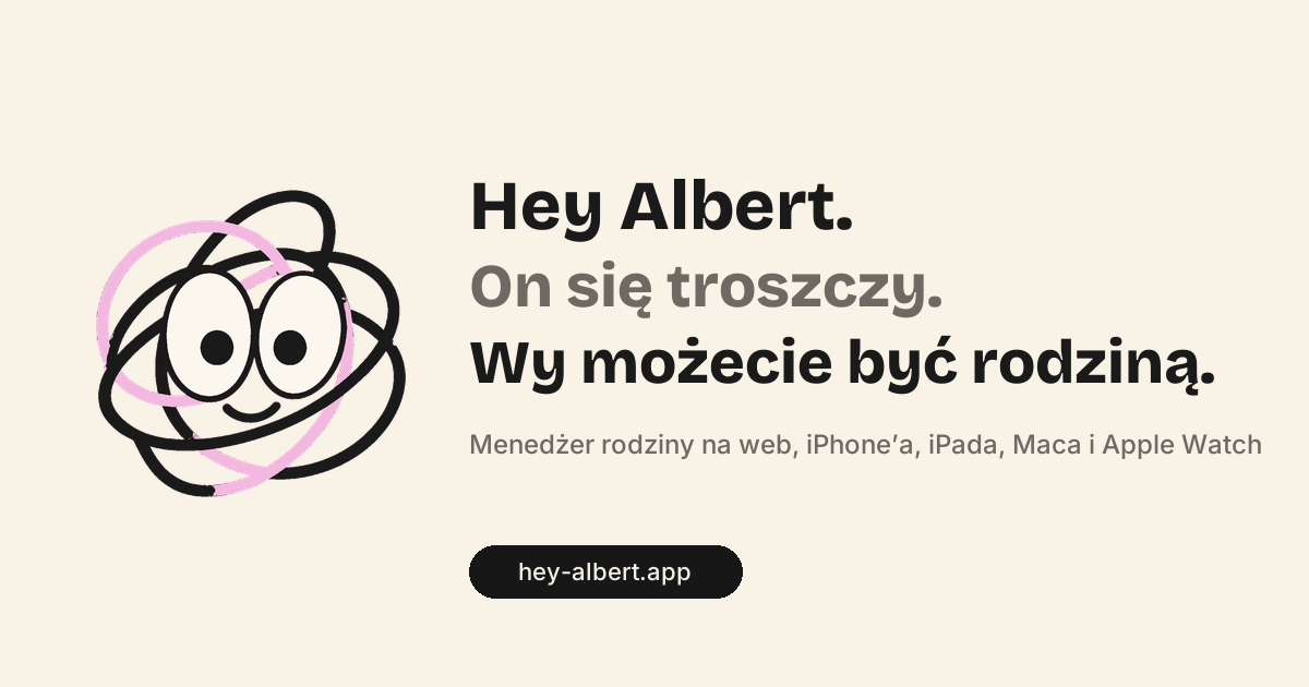
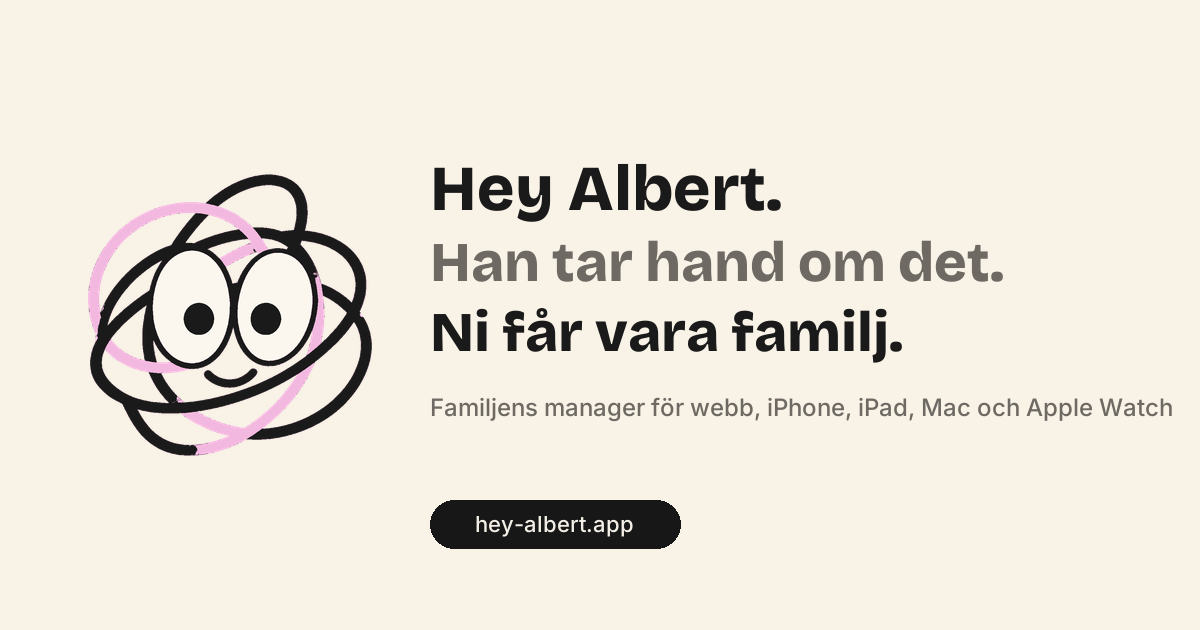
Anyone sharing a link sees this image in WhatsApp, iMessage or search. One version per language, 1200 × 630 pixels, generated by tooling/og-bilder.py.
Performance and accessibility
Technology is trust. The bar is set in apps/site/lighthouserc.json and runs in CI.
| Check | Target |
|---|---|
| Performance, phone | at least 95, measured 97 to 98 |
| Performance, desktop | 100 |
| Accessibility | 100 |
| Best practices | 100 |
| SEO | 100 |
| LCP | target under 1.5 s; measured 2.3 to 2.5 s on the phone under simulated slow 4G |
- Text is HTML, never an image.
- Fonts are served locally, never from Google’s servers.
- No cookie wall. PostHog runs without a cookie until someone agrees.
- The first image of every page loads without a fade-in, as AVIF with WebP as fallback.
Blocks from the design system
The page is built from Payload. Every block in Payload has exactly one component in packages/design-system/bloecke. Agents fill blocks; they never design.
AufrufBausteineBereicheBildEintragenFaqHeroHinweisleistePreiseSatzSchritteTextThemenUmfrageVergleichZitat
The components of the earlier static home page — WebNavigation, EmailZeile, Vertrauenszeile, SzeneKarte, PreisKarte, Akkordeon, StickyKnopf and more — are in the chapter Components.
Checklist before going live
- Five-second test with five to eight parents. If two say „a calendar“, the hero is not done.
- Every sentence is true: the feature exists, or the sentence goes. Per language.
- No word from the never list, no superlative, no exclamation mark, no other product by name.
- Only the Sonntag family, in every screen and every number.
- No children’s faces. Exactly one real photo: the founder.
- Button on the first screen on the phone.
- Lighthouse green in CI.